Digital Paper That’s Different
Designs That Rock
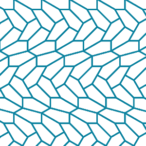
Born from Vectors
All designs begin as vector illustrations, ensuring crisp edges and sharp rendering
Inspired Designs
Traditional and contemporary patterns in bespoke color palettes for professional results
600ppi Resolution
Scale each pattern to hundreds of custom sizes without sacrificing display or print quality
Versatile Format
Digital Paper is also great for web backgrounds, pattern fills, découpage, and scrapbooking
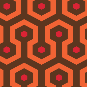
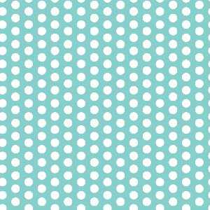
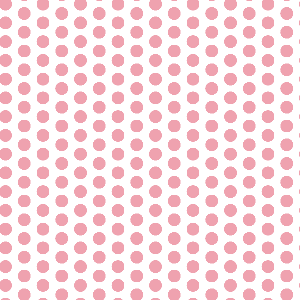
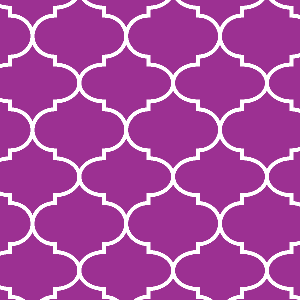
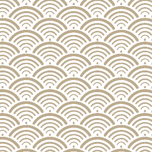
CP Basics
a digital paper collection of classic patterns in a coordinated palette of 18 beautiful hues
This is where the text for the front of your card should go. It's best to keep it short and sweet.
This is where the text for the front of your card should go. It's best to keep it short and sweet.
This is where the text for the front of your card should go. It's best to keep it short and sweet.
This is where the text for the front of your card should go. It's best to keep it short and sweet.
This is where the text for the front of your card should go. It's best to keep it short and sweet.
This is where the text for the front of your card should go. It's best to keep it short and sweet.
This is where the text for the front of your card should go. It's best to keep it short and sweet.
This is where the text for the front of your card should go. It's best to keep it short and sweet.
This is where the text for the front of your card should go. It's best to keep it short and sweet.
This is where the text for the front of your card should go. It's best to keep it short and sweet.
This is where the text for the front of your card should go. It's best to keep it short and sweet.
This is where the text for the front of your card should go. It's best to keep it short and sweet.
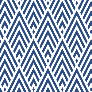
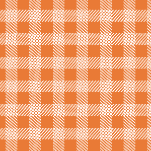
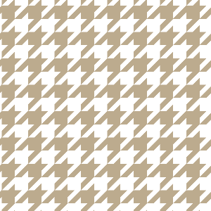
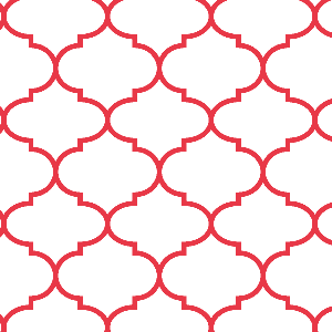
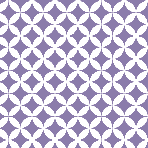
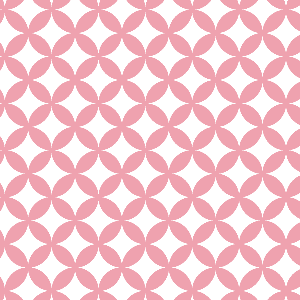
À la carte
individual paper patterns in a variety of different color palettes